A frequency polygon is another way to show the information in a frequency table. It looks a little bit like a line graph. To make a frequency polygon, you just need to plot a few points and then join the points by straight lines. So what points do you need to plot? Well, first you have to find the midpoints of each class. The midpoint of a class is the point in the middle of the class. So for instance, if I have a class “10 – 19”, then the midpoint is 14.5. A class of “0 – 5” has a midpoint of 2.5.
So say we have the frequency table from the earlier example:
Sponsored Links
|
Mark Class |
Frequency |
|
1-5 |
1 |
|
6-10 |
5 |
|
11-15 |
8 |
|
16-20 |
6 |
What people usually do is add an extra column showing the midpoints of each class like this:
|
Mark Class |
Frequency |
Midpoint |
|
1-5 |
1 |
3 |
|
6-10 |
5 |
8 |
|
11-15 |
8 |
13 |
|
16-20 |
6 |
18 |
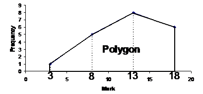
Now what we’re going to do is plot a graph showing the frequency for each midpoint. For instance, the frequency for the midpoint value 8 is 5. The midpoint values are shown along the horizontal axis, and the frequency values are shown along the vertical axis like for a histogram:
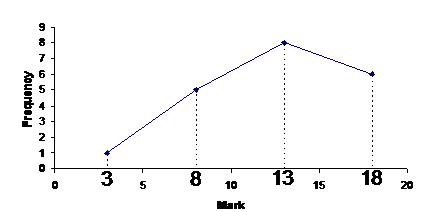
The reason it’s called a polygon is because the line sort of forms a plane shape with the horizontal axis as one side of the shape:
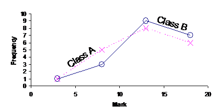
Now a frequency polygon and a histogram both show the same information, but in a different way. Why would we want to draw a frequency polygon instead of a histogram? Well, the most common reason is if we want to compare two different sets of data. For instance, say we had the exam marks for another class, also with 20 students, let’s call this other group of students Class B. Class A will be the first class of students we looked at.
|
Class B |
||
|
Mark Class |
Frequency |
Midpoint |
|
1-5 |
1 |
3 |
|
6-10 |
3 |
8 |
|
11-15 |
9 |
13 |
|
16-20 |
7 |
18 |
Don’t get confused by all the use of the word ‘class’. In this question, the word has two meanings. We are using it to describe both the two groups of school kids – Class A and Class B, but also the mark classes we’re sorting the data into: 1 – 5, 6 – 10, 11 – 15, 16 – 20.
We could plot this frequency table on the same set of axes as we used for our first class. We’d have to make sure it was easy for the reader to tell the difference between the two lines. You may want to use a different colour pen for each line, one line could be blue and one line could be red. Or you could do what we do here (since we haven’t got any colour), and make one line a solid line, and the other a dashed line. It also helps if you label the two lines as well. You can also use different symbols for the points you plot – you could plot one line with crosses, and one line with circles for instance.
Now in an exam you might get a question like this:
|
Comment on the marks obtained by Class A and Class B |
|
Solution |
|
That’s a pretty general question – what the heck do they want us to do? Well, you’ve got to think about the context of the data – what is the data about? Well, in this case, they’re the marks students in two classes got on an exam. What might someone looking at this information be interested in? Well, the fact that there are two classes should suggest something to you – you could compare how the two classes went on the exam. So, the bigger the mark, the better a student has done right? A high mark out of 20 is good, and a low mark out of 20 is bad! Pretty simple stuff. Okay, so let’s look at the frequency polygon. Notice how Class A had more students with low marks – the dashed line (representing Class A) is higher than the solid line (representing Class B) in the left hand area of the graph. This tells us that Class A has more students who performed poorly than Class B. What about on the right hand side of the graph, in the higher marks section? Well, in this section the solid line (representing Class B) is higher than the dashed line (representing Class A). This tells us that Class B had more students with high marks on the exam. So all up this tells us what? Well, Class B has fewer students with low marks and more students with high marks when compared with Class A. This means that Class B went better on the exam than Class A. So you might say something like: From looking at the frequency polygons, Class A has more students who scored a low mark on the exam than Class B. The graph also tells us that Class B has more students who scored a high mark on the exam than Class A. This tells us that Class B performed better on the exam than Class A. |
Handy Hint #1 - When can you compare frequency polygons
Notice how the two classes we compared in the last section both had the same number of students in them – 20 in each. This makes it very easy to compare how the two classes went on their exam. It becomes a little more difficult to compare the two school classes if they’re different sizes. For instance, if Class B had 30 students in it, the overall graph might have looked like this:
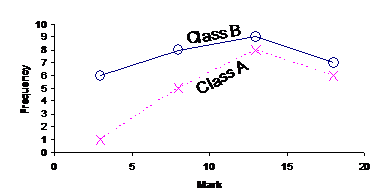
Now, the entire line representing Class B is above Class A. This tells us that Class B had more students who bombed on the exam and more students who went well on the exam than Class A. But this is partly due to Class B just having more students than Class A. So which is the better class? Well, it’s not that easy to tell from the graph. Another way to analyse and compare the two classes is to look at the mean, median and mode of the data. The next section shows how to calculate these from a frequency table.