Pictographs are a visual way of presenting statistical information. The ‘pict’ part of the word should tell you how they do this – they use pictures! For instance, you could use pictures of apples to represent a certain number of apples, perhaps one apple picture could represent 100 apples. Another common pictograph type uses stick figure people to represent a certain number of people.
|
Sponsored Links |
||||||||||||||||||||||||
|
This table shows the height data for all the students at
a school. Show this information as a pictograph, with
|
||||||||||||||||||||||||
|
Solution |
||||||||||||||||||||||||
|
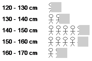
You can draw a pictograph in several ways, the main thing is to make sure it’s clear and easily understandable. In this case, we can write down the categories in a vertical direction like this: Of course, now we have to show how many students there are in each category. This is where the pictures come in. For instance, in the 120 – 130 cm category, there are 5 students. In the question we’ve been told that one stick figure represents 10 students. So what do we do when we only want to show 5 students? Well, we can draw a fraction of a stick figure. In this case, 5 is exactly half of 10, so we draw half a stick figure. Now, you’ve got two main options:
The left way of drawing it is the better option, because from the picture it is easy to tell that we’ve got exactly half a person. The picture on the right isn’t so clear – we could have 0.5 of a person, but we could also have 0.4 or 0.6 of a person. Try and draw things in a way that conveys (gives) the reader the most information possible. So next to each of our categories we just need to draw the appropriate number of stick figures, including fractional stick figures. For the 130 – 140 cm category, we need almost two whole stick figures. Do this for all the categories and you should get something like this:
Often pictographs reduce the accuracy with which the data can be presented – for instance in the above diagram, it’s hard to tell exactly what fraction of a stick figure some of the partial ones are. But they have the advantage of reinforcing what the data is about – in this case, the number of people (students to be precise). Also, to a lot of people they are more visually attractive than a straight bar graph or pie chart. Especially in an area such as advertising, they often are the presentation choice because people are more likely to look at them rather than being put off by numbers. |


