Water flow graphs
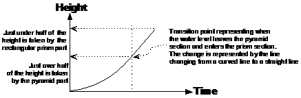
One type of problem you will probably come across is to sketch a graph showing how water flowing at a constant rate fills up containers of various shapes. For instance, if I had a rectangular prism type shape, the graph of water height versus time would look like this:
|
Sponsored Links |
|


Because this prism has the same cross section all the way from the bottom to the top, the rate at which the height of the water would rise would be constant. The rate at which the water level rises is represented by the slope of the graph. If the rate is constant, the slope stays the same – the line is a straight one. If the rate increases (the water level starts going up more quickly), the slope becomes steeper. If the rate decreases (the water level starts going up less quickly), the slope becomes less steep. For this case, a constant rate means a straight line on a graph, like the one here.
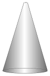
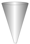
However, there are more complicated container shapes for which the graph isn’t so simple to plot. For instance, take the example of a cone:
When the water first starts flowing into the tiny hole at the top, it will fill up the bottom of the cone. The bottom of the cone has a large cross sectional area, so the height will go up slowly at first.
When the water reaches the halfway mark, it will be filling at a much quicker rate. Halfway up the cone, the diameter of the cross sectional area has halved. Or we could just as easily say that the radius of the cross sectional area has halved. Now, because the area of a circle relies on the square of the radius, halfway up the cone the area of the cross section will be a quarter the area of the base. So when the water level is at the halfway mark, the water height will be rising four times as fast as at the start.
So instead of being a straight line graph, the line will start sloping upwards slightly (to represent the water height increasing gradually). Then, as time passes and the water height gets higher, the line will slope more and more steeply upwards, to represent the fact that the water height is increasing more rapidly:
|
|
|

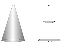
If the cone was upside down, we’d have the opposite of this graph – at first the water height would rise very quickly and then it would slow down:
|
|
|

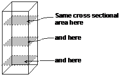
You can also have combination shapes. It’s best to analyse what the graph would look like for each bit of the shape, and then join the lines together. For instance, this shape:
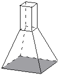
The bottom of this shape has the largest cross section, so the water level would rise slowly at the start. Then, as the water level rose in the bottom shape, the cross sectional area would reduce, and the rising speed would increase. At the top of the pyramid part, the rising speed would be fast.
The next question is – what happens to the rate when the water’s rising up in the rectangular prism section? Well, the cross sectional area of this section is constant all the way to the top. It’s also the same size as the very top of the pyramid part. This means the rising rate will be the same throughout this section as it was at the end of the pyramid section:
One thing to be careful with is to make sure that you get the transition point at the correct location. The transition point is the spot on the graph representing when the water level leaves one part of the shape and starts filling up the next one. Looking at the shape diagram, it looks like just over half of the total shape’s height is in the pyramid. Just under half of the pyramid’s height is from the rectangular prism on top of the pyramid. This means the transition point should be just over halfway up the vertical axis of the graph: